A university with one campus and a dozen front doors
The website wasn't too simple to use - it was too much to use, for a student who only came for one thing.
Tel Aviv University is Israel's largest public research university, and every year roughly 30,000 students pass through it across every program and degree level. Each of them needs something different from the university's systems - but the existing site showed everyone the same overloaded, largely irrelevant experience.
Our job was to find the small set of actions and information each student actually needs on a given day, and surface only that - turning a maze of systems into one place worth opening.
Six stages, from first survey to a system still growing
The engagement moved from broad discovery into a live, expanding platform - each stage narrowing in on what actually mattered to a student logging in between classes.
01. Quantitative research - survey: A satisfaction survey distributed to over 7,000 students to map initial pain points and how university systems were actually being used.
02. Qualitative research - interviews: In-depth interviews with students and stakeholders to map the existing experience and distill needs, pain points, and opportunities.
03. Comparative research - benchmark: A review of websites and systems with similar characteristics to a student personal-information portal.
04. Concept development: Specification of the homepage and an additional area, establishing the information architecture that framed everything built after.
05. From concept to detailed MVP: A visual language and detailed specification for the homepage and key areas - tuition and grades among them.
06. Continued system expansion - ongoing: Continued specification and design of additional system areas and user types, as the platform keeps growing.
Three different problems wearing one name: "the website"
Poor communication, scattered systems, and a cumbersome interface all got blamed on "the site" - but each needed a different fix.
"Missing a single place centralizing only what matters to students."
Poor communication: Difficulty staying updated on important events and messages from the university, and difficulty finding contact details of relevant university staff.
Multiple systems: Multiple entry points into services students need every week, with services scattered across many separate systems - each with its own login and layout.
Cumbersome UX: Information overload and irrelevant content shown to every student alike, plus too many clicks to complete a simple action on an outdated interface.
A personal home, not a portal
Every screen was measured against a simple test: does this belong to this student, today?
Instead of a generic gateway to dozens of systems, the product became a personal home base. The homepage adapts to the individual student and their moment in the semester, surfacing tasks, updates, grades, and payments in one view.
Two anchor areas were defined first - grades and tuition - as the highest-impact entry points, with the information architecture designed to absorb future areas without breaking the mental model.
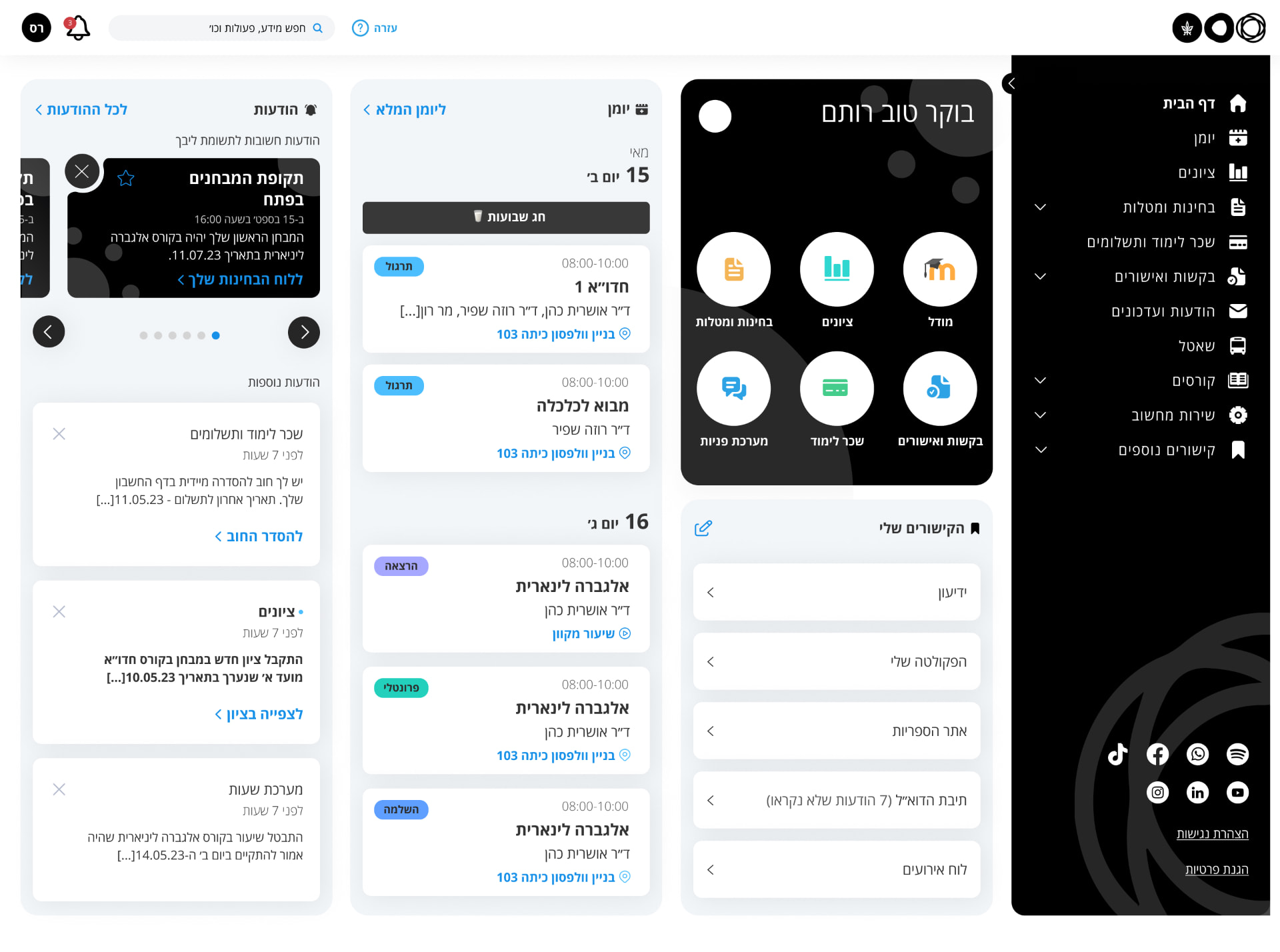
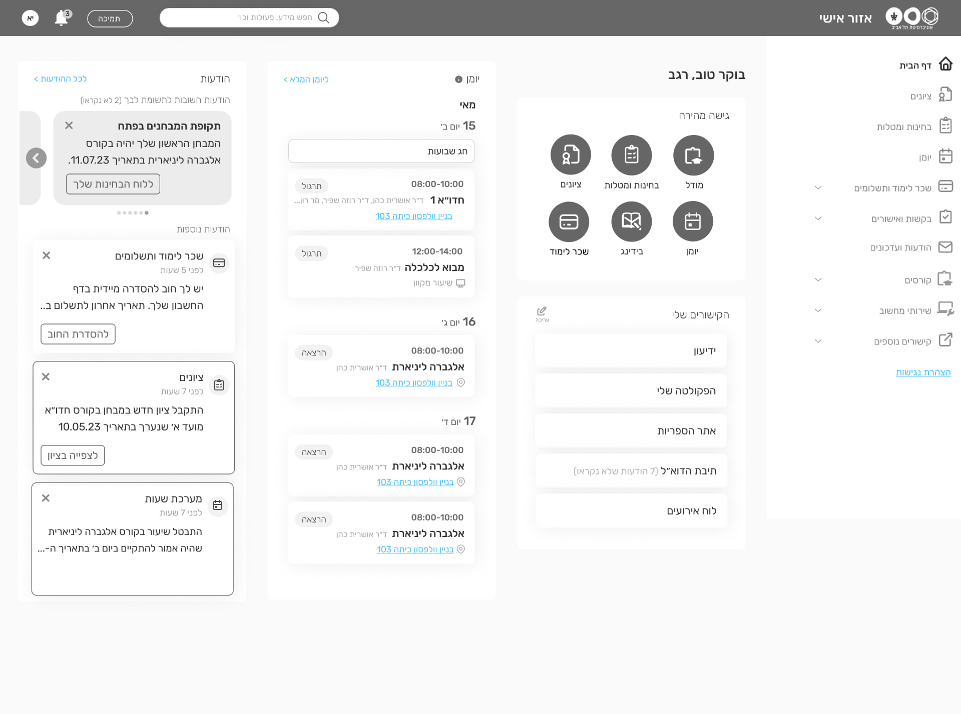
One dashboard, built from what students actually open daily
Dashboard
quick access to common actions and information: An area that centralizes the topics that matter most in a prominent location, so students reach what they need without hunting for it.
Personal links
edit and add links to display: Common links surfaced up front, editable to match each student's own usage patterns - with the option to add any university link by pasting its URL and naming it.
Grades
filtering, sorting, and summary display: A grades table with filtering and sorting, plus summaries by filter - comparing periods like Year 1 vs. Year 2 average, and viewing cumulative totals at a glance.
Tuition
payments, approvals, charges and credits in one place: An account page showing exactly what's left to pay this year, consolidating every payment requirement and approval, with all charges and credits clearly displayed.
Dashboard
quick access to common actions and information: An area that centralizes the topics that matter most in a prominent location, so students reach what they need without hunting for it.
Personal links
edit and add links to display: Common links surfaced up front, editable to match each student's own usage patterns - with the option to add any university link by pasting its URL and naming it.
Grades
filtering, sorting, and summary display: A grades table with filtering and sorting, plus summaries by filter - comparing periods like Year 1 vs. Year 2 average, and viewing cumulative totals at a glance.
Tuition
payments, approvals, charges and credits in one place: An account page showing exactly what's left to pay this year, consolidating every payment requirement and approval, with all charges and credits clearly displayed.
What carries into the next phase
Personalization beats completeness. A homepage that tries to show everything shows nothing clearly. Distilling to what one student needs today, not what the university could technically display, is what made the dashboard feel worth opening.
Research at scale changes the brief. Surveying over 7,000 students before drawing conclusions meant the concept was built on patterns, not anecdotes - and it kept the team honest about which pain points were universal versus rare.
A system this size is never "done". With the homepage and core areas shipped, the same information architecture now frames every new area added - grades and tuition were the proof of concept, not the finish line.